BLU Perspective
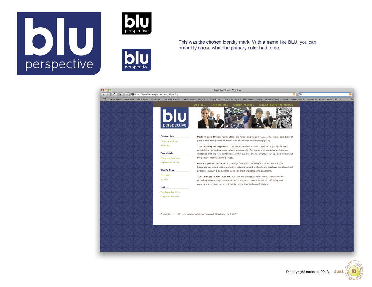
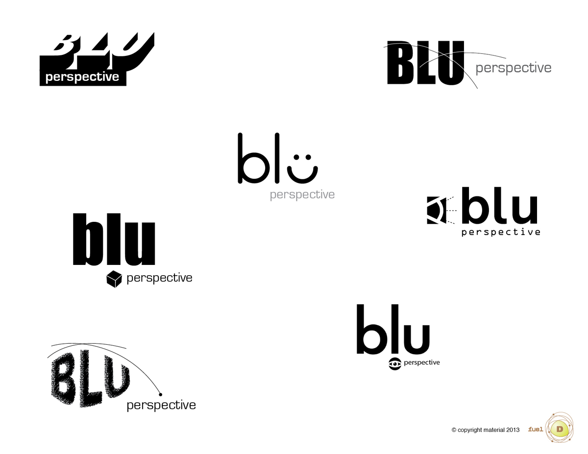
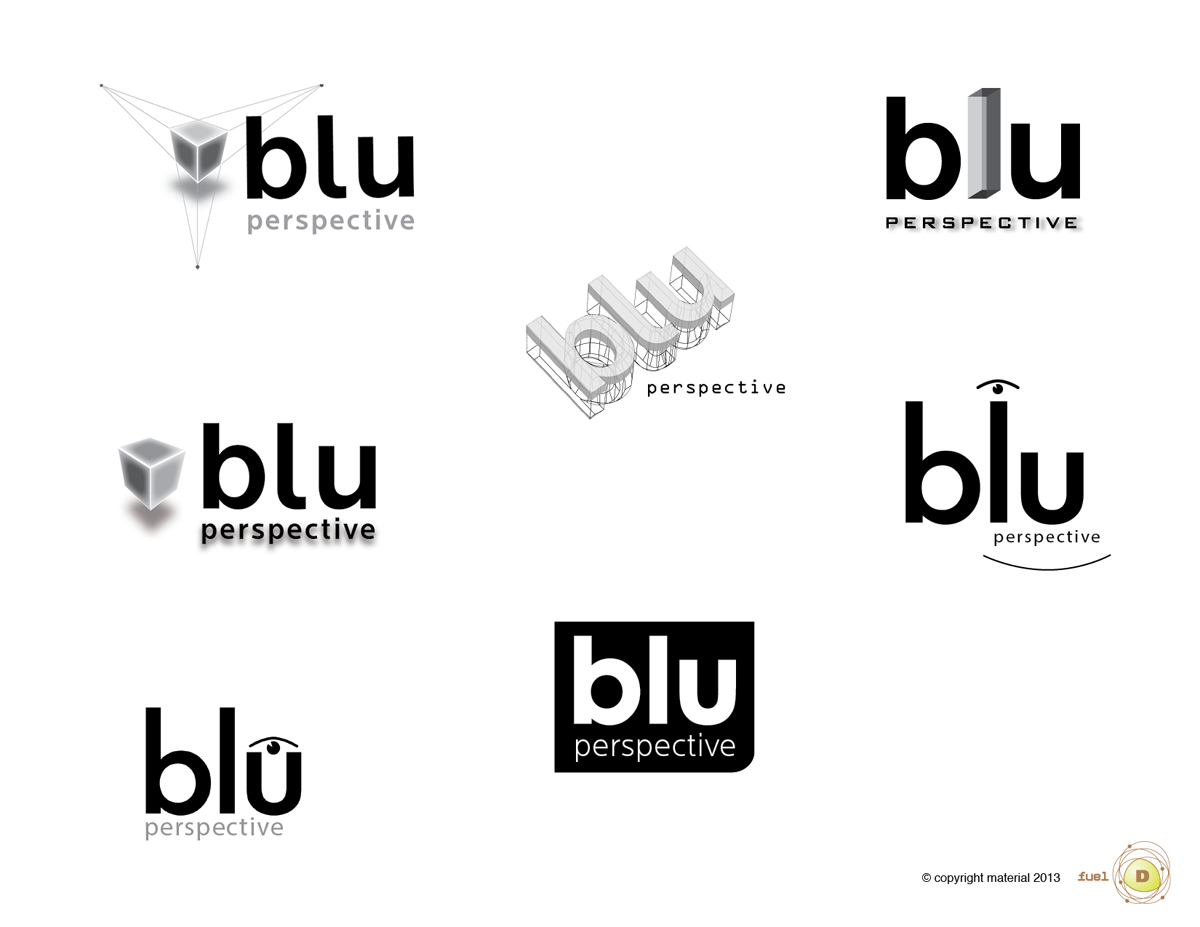
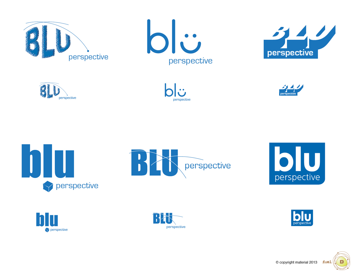
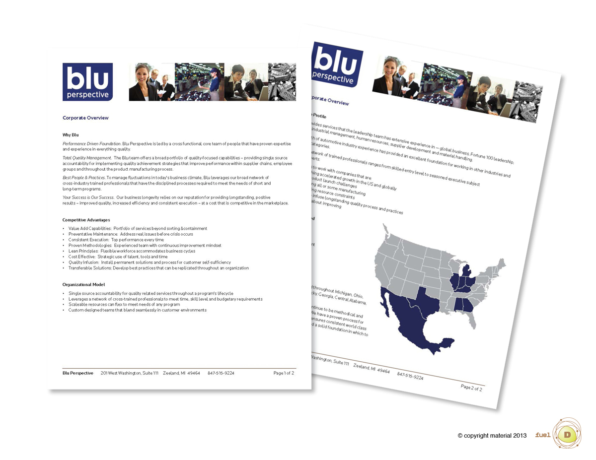
BLU perspective is a small, but growing company that needed to be perceived as a competent alternative to the larger players in their market space. The reality was they did not have the financial resources their counterparts do. A modest budget allowed us to explore and decide very efficiently. As a first priority, we worked directly with the owners of BLU Perspective to articulate their overall key messages. Based on those, we moved into the creative development of the BLU visual identity, including the graphic mark (logo), their website and collateral materials. We provided BLU with the ability to manage their own website and develop their own promotional materials long term. We did this by building their website on a user friendly platform. We also developed a graphics standards package that included identity use guidelines, raster files and various pre-formatted templates for them to rely on. This brand infrastructure kept their long term costs lower by providing them the ability and confidence to take a DIY approach, yet still have consistency in their brand visual identity and key messages. Although this project was small in scope, it provided a good design foundation, effective brand building and client independence within limited financial constraints.

